
Develop
When it comes to developing the app, I started wtih sketching out three different directions wtih a few examples for each section. I then went through the paper prototyping process to gather feedbacks from my users and started to build the wireframe wtih annotations. After deciding on a specific visual style, I applied it to the wireframe and completed the final prototype.
Sketching
Paper Prototyping
To start with, I wrote down the tasks that my users will complete with my app. I then neatly drew the interfaces on paper that represents the dimensions of the iPhone X and simulated the task flows in the paper prototype. I invited three users to participate in my paper prototyping process. Due to the influence of COVID-19, I was only able to find my roommate and two of my neighbors.


Testing Feedbacks
Melody
(28, Taiwan, Web Design Student, Master’s Degree)
Navigates the app smoothly without extra guidance
Thinks that I can make the app more intriguing by adding interactive elements
Believes that it’s nice to have visuals that are of good quality and easily understandable
Thinks that the bar navigation is easier and quicker for the users
Yishu
(24, Guangzhou, Finance Student, Bachelor’s Degree)
Navigates the app smoothly without extra guidance
Finds it nice to have fixed screen (rather than scroll) for the “Accidents” section as he can find the most important info as quickly as possible
Thinks that the “Login” page is not necessary and it takes time
Believes that push notification can work if it’s inviting users to learn in a fun way
Michael
(37, Seoul, Shop Assistant, High School Degree)
Navigates the app smoothly without extra guidance
Thinks that the 911 direct call button should be separated from the others, such as the “next” button, so that users won’t mistakenly click it.
Suggests that the app should have some pop-up instruction for first use
Thinks that the more “urgent” features should be placed at the center of a screen
Insights
Making Access Quick
Simplifying some of the steps and pages will make users navigate back and forth less often.
Given the fact that this is an emergency app, the “Register” page can be skipped and competed later in the “Profile” section and the “Login” page is not necessary and should be replaced with automatic login (for second-time users).
For the “Accidents” section, fixed screens should be used instead of the scroll one because it’s easier and quicker to access information.
The most important part such as “First Aid Kit” in the “Prepare” section should be centered (and definitely not under the fold in the scroll screen)
Adding Clarity and Context
Adding short and easily understandable instruction in the form of pop-up windows can better help first-time users.
The 911 director call button should be available throughout the “Accidents” section and should be separated from other buttons so that users won’t mistakenly click it.
Motivating the Users Better
A reward system can be added to motivate people learn about first-aid knowledge (e.g. badges, collections, sharing and competing features).
Using friendly and inviting push notifications can help getting users back to the app.
Building a more connected community environment will add more personal touch to the app, making it less of just a tool.
Annotated Wireframe 01
In the first draft of my wireframe, I completed the basic skeletal framework of my app. However, the biggest problem was that I only typed out the major titles and used greek texts for body copy, which made the content of the app a little bit hard to understand.
Annotated Wireframe 02
With the feedbacks from the first draft, I made the wireframe much clearer by adding enough context and incorporating appropriate graphics. I also rearranged some of the sections and elements to allow the app to flow in a smoother way.
Heuristic Evaluation
Heuristic evaluation is an inspection method for finding the usability problems in a user interface design by examining an interface and judging its compliance with recognized usability principles. I listed out the 10 usability heuristics from medium.com as a guide for me to evaluate my app.
Visibility of System Status
The system should always keep users informed about what is going on, through appropriate feedback within reasonable time.
Match Between System and the Real World
The system should speak the users' language, with words, phrases and concepts familiar to the user, rather than system-oriented terms. Follow real-world conventions, making information appear in a natural and logical order.
User Control and Freedom
Users often choose system functions by mistake and will need a clearly marked "emergency exit" to leave the unwanted state without having to go through an extended dialogue. Support undo and redo.
Consistency and Standards
Users should not have to wonder whether different words, situations, or actions mean the same thing.
Error Prevention
Even better than good error messages is a careful design which prevents a problem from occurring in the first place. Either eliminate error-prone conditions or check for them and present users with a confirmation option before they commit to the action.
Recognition Rather Than Recall
Minimize the user's memory load by making objects, actions, and options visible. The user should not have to remember information from one part of the dialogue to another. Instructions for use of the system should be visible or easily retrievable whenever appropriate.
Flexibility and Efficiency of Use
Accelerators — unseen by the novice user — may often speed up the interaction for the expert user such that the system can cater to both inexperienced and experienced users. Allow users to tailor frequent actions.
Aesthetic and Minimalist Design
Dialogues should not contain information which is irrelevant or rarely needed. Every extra unit of information in a dialogue competes with the relevant units of information and diminishes their relative visibility.
Help Users Recognize, Diagnose, and Recover from Errors
Error messages should be expressed in plain language (no codes), precisely indicate the problem, and constructively suggest a solution.
Help and Documentation
Even though it is better if the system can be used without documentation, it may be necessary to provide help and documentation. Any such information should be easy to search, focused on the user’s task, list concrete steps to be carried out, and not be too large.
Reference: https://medium.com/@erangatl/10-usability-heuristics-explained-caa5903faba2
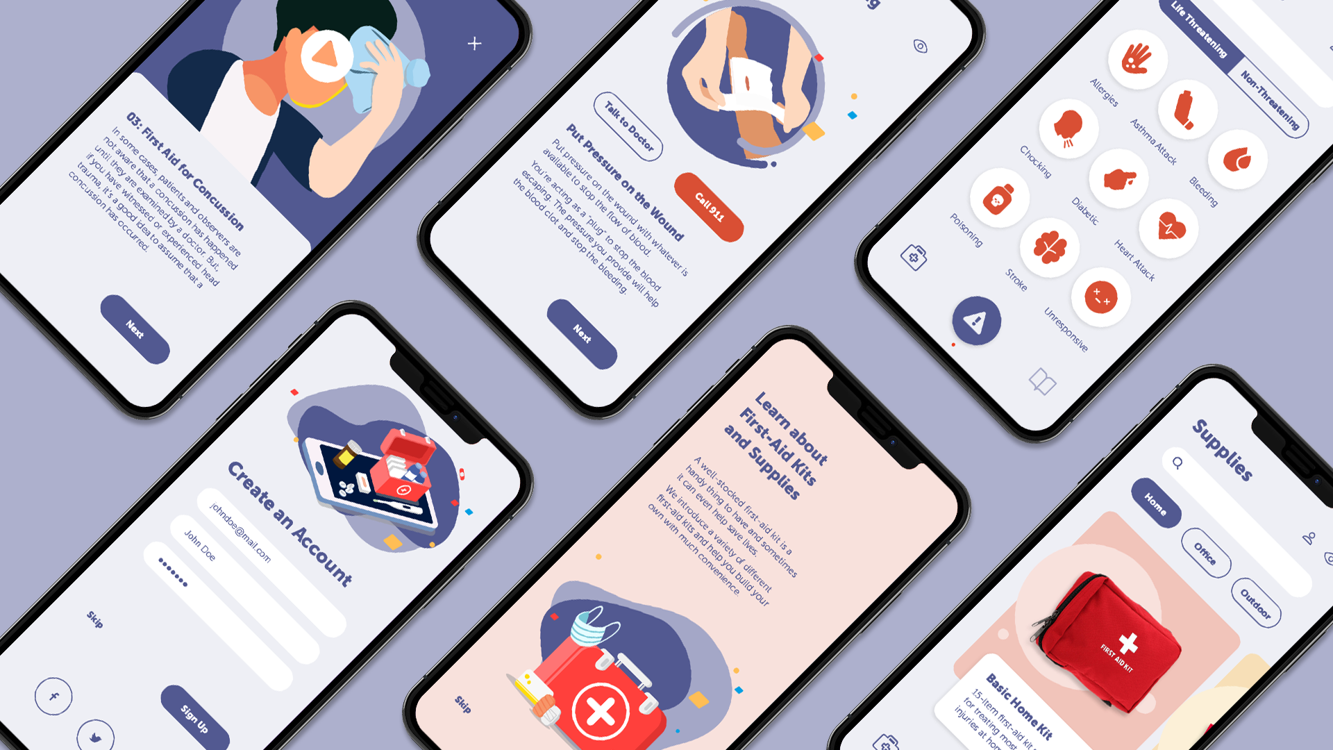
Clickable Wireframe
After a few rounds of explorations and refinements, I developed a clickable wireframe that to a large extent defines how my app should look like from a layout and structure standpoint. To see the clickable wireframe, check out this link. Or watch the video demonstration below:

Visual Inspirations
To better explore possible visual styles for my app, I developed three visual inspiration boards that are of distinct looks and feelings. Each board contains a mood board, a design board and the paired color palette, icon style and type choice.
Direction 01

Direction 02

Direction 03

Summary
All three directions above have potentials. Given the fact that my app has a “course learning” quality and that I hope to distinct it from the traditional serious-looking medical apps, I decided to lean towards the third direction, friendly and approchable, while incorporating some of the first direction features, clean and calm, into it.
Visual Style Guide
After the exploration phase, I developed a visual style guide that is specific to my app. I defined what typeface to use and how it should be used under different situations. I also identified the color palette, icon style and button style that guide my design throughout the process. Meanwhile, I discovered that adding unique illustrations would elevate the overall look and experience of my app, so I commissioned an illustrator to create a set of illustrations.

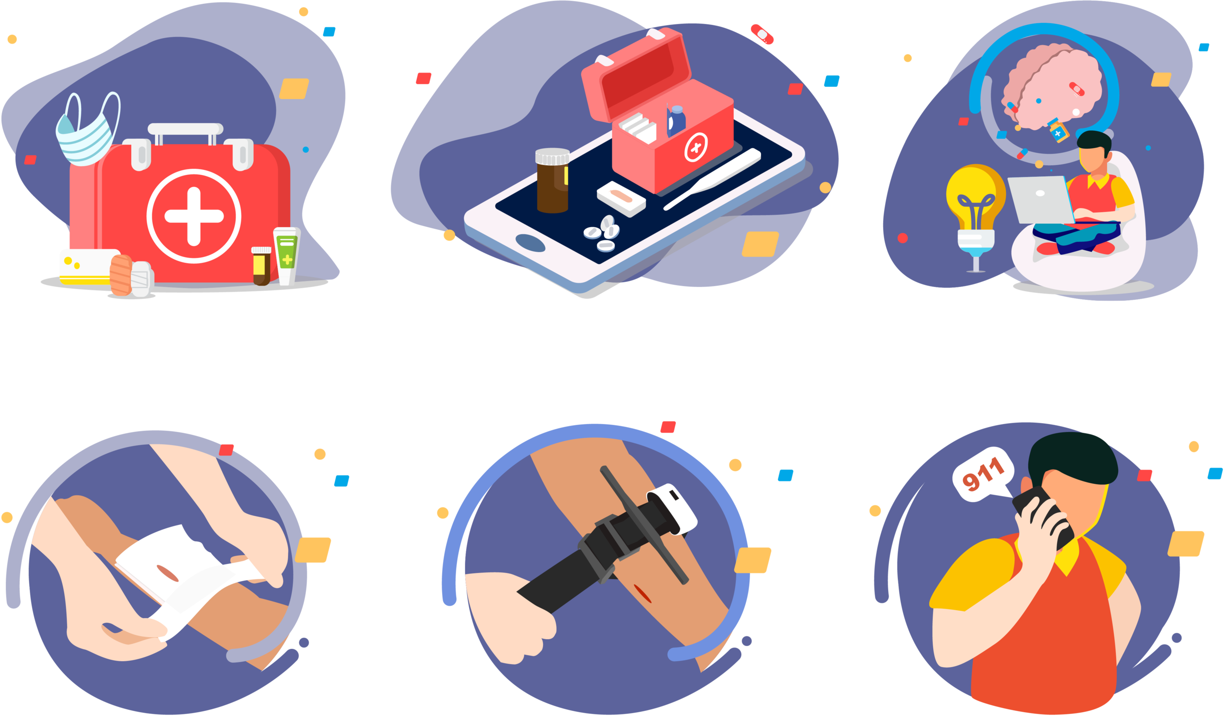
Illustrator: Miandong Ruan
Final Prototype
To see the full final prototype presentation, visit the next section, Prototype, on this site.